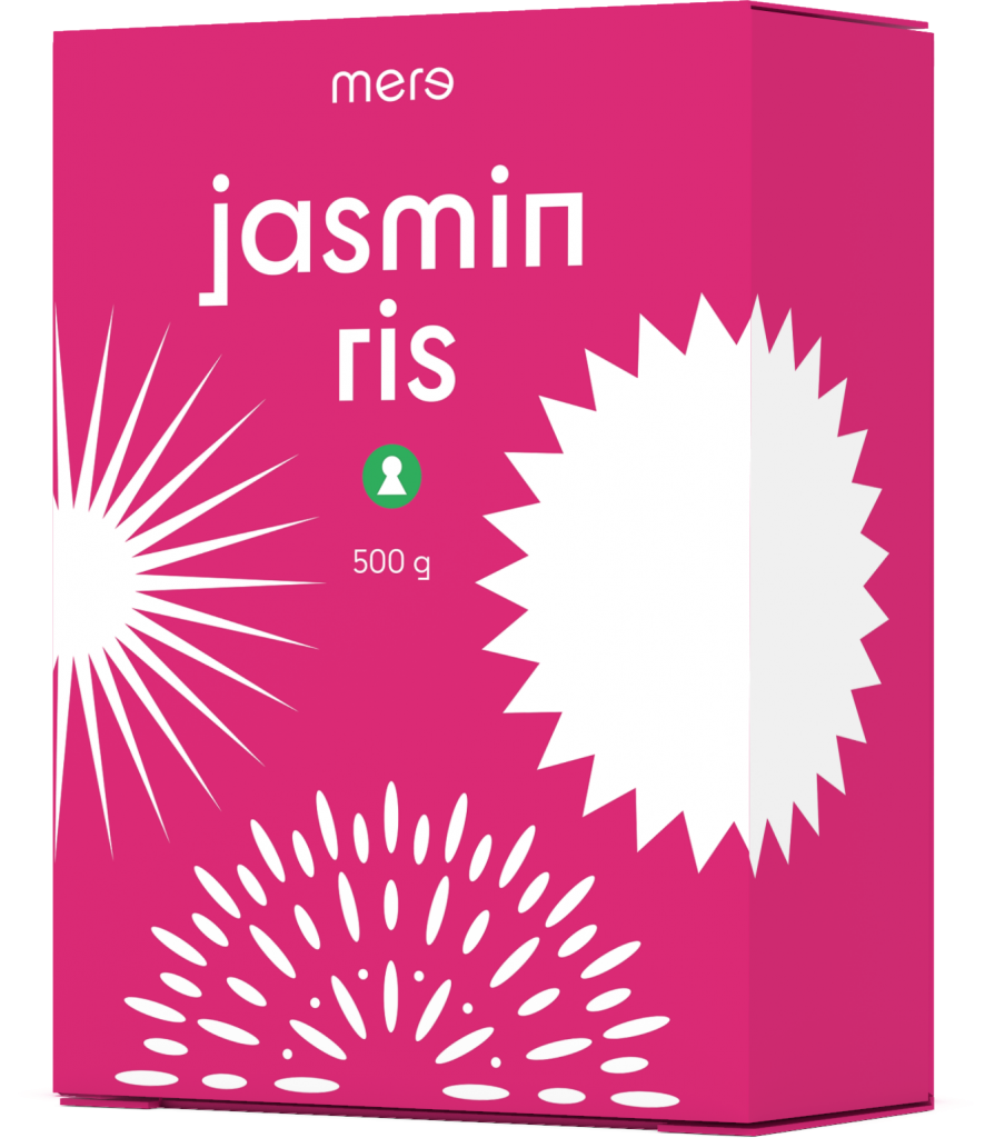
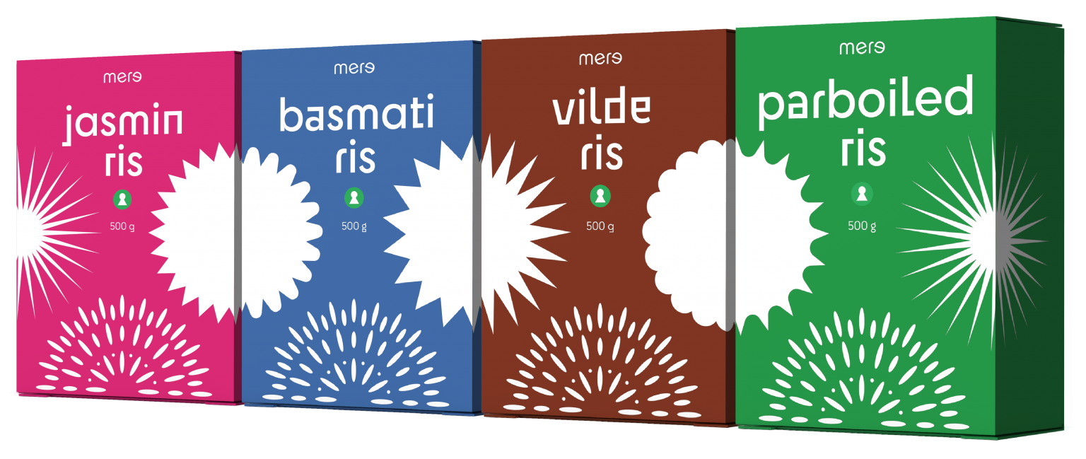
»Mere« (meaning »more« in Danish) is a discount private label, offering affordable everyday products. The task was to create a logo and packaging design for their line of rice, but a design system that can be expanded to other products.
The logo is set in Supertype's Cy, but the e's are nodding their heads and smiling at each other.
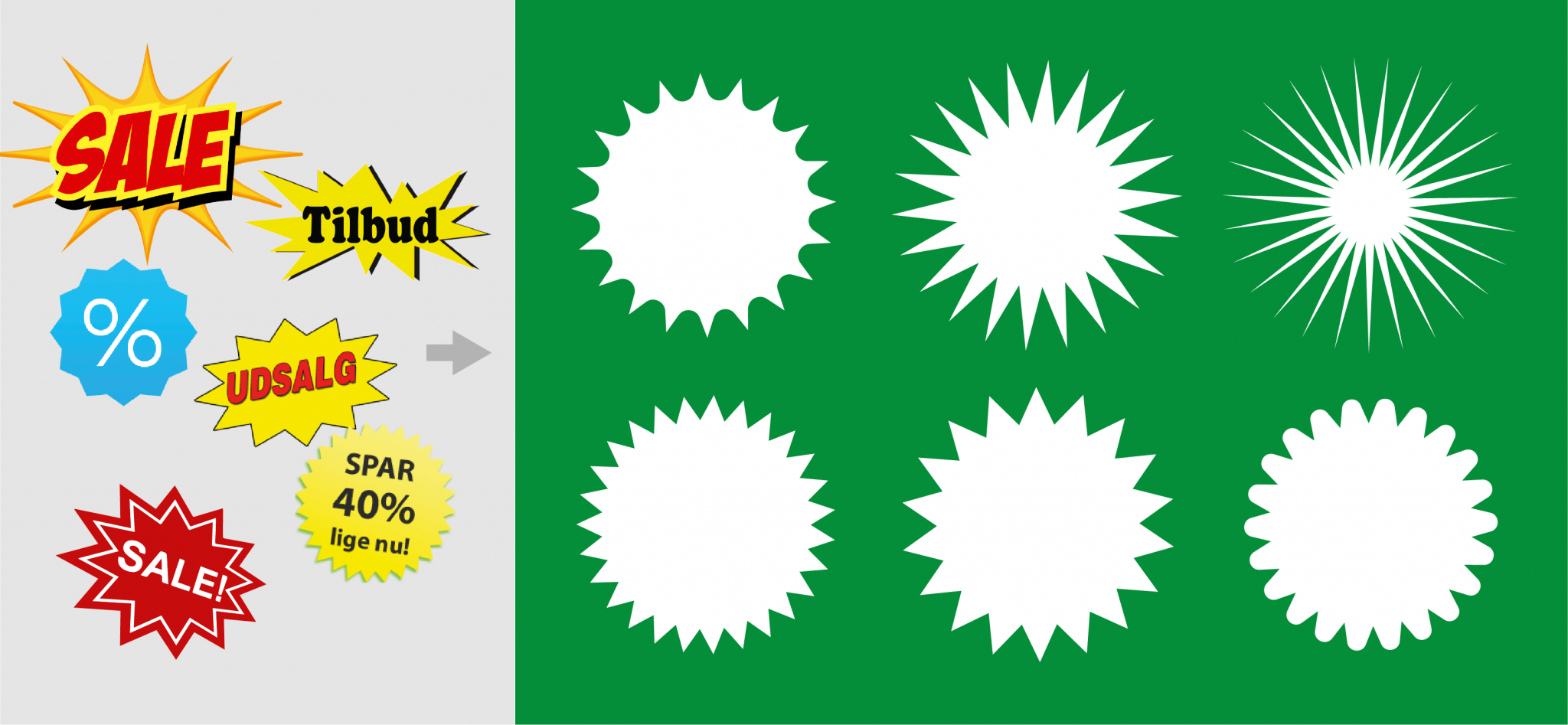
The classic sale sign gets a remake, keeping the attention-grabbing effect, but without (all of the) cheesiness. It creates an interesting pattern spanning across the different packs, and demands attention from bottom shelf. The signs are paired with an illustration of rice.
Cy is used for product names, and with its many alternate characters the typeface adds humor and personality.